Category Archives: Bowls

Shoreline

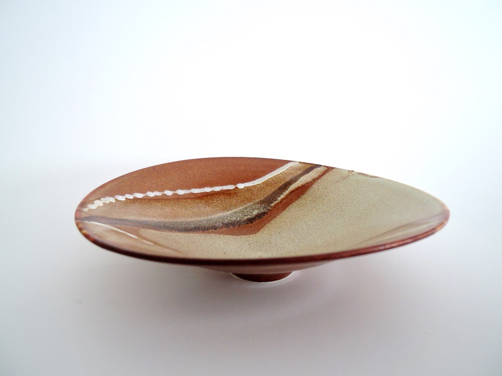
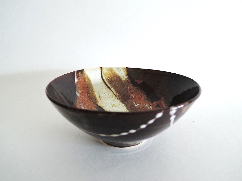
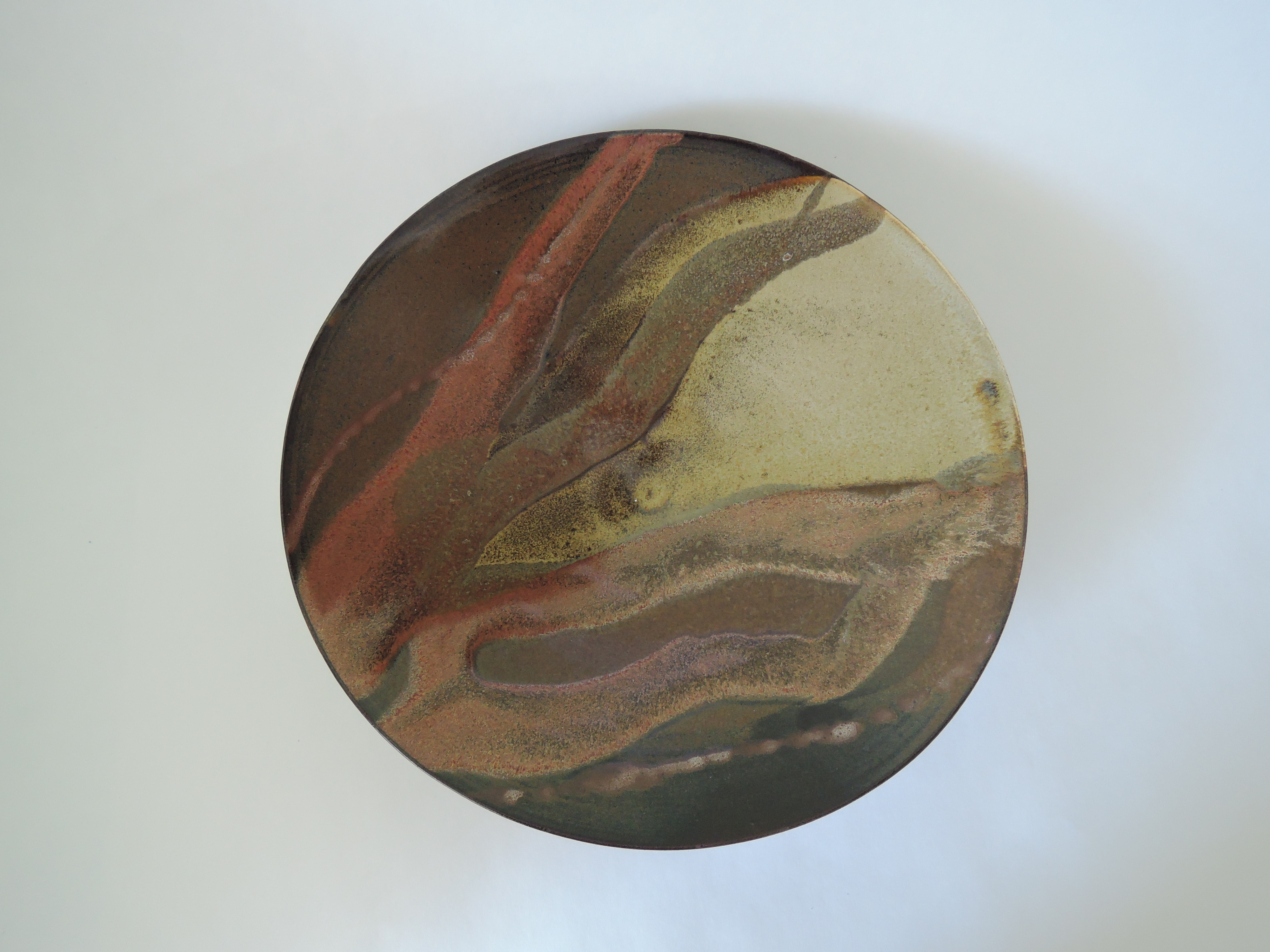
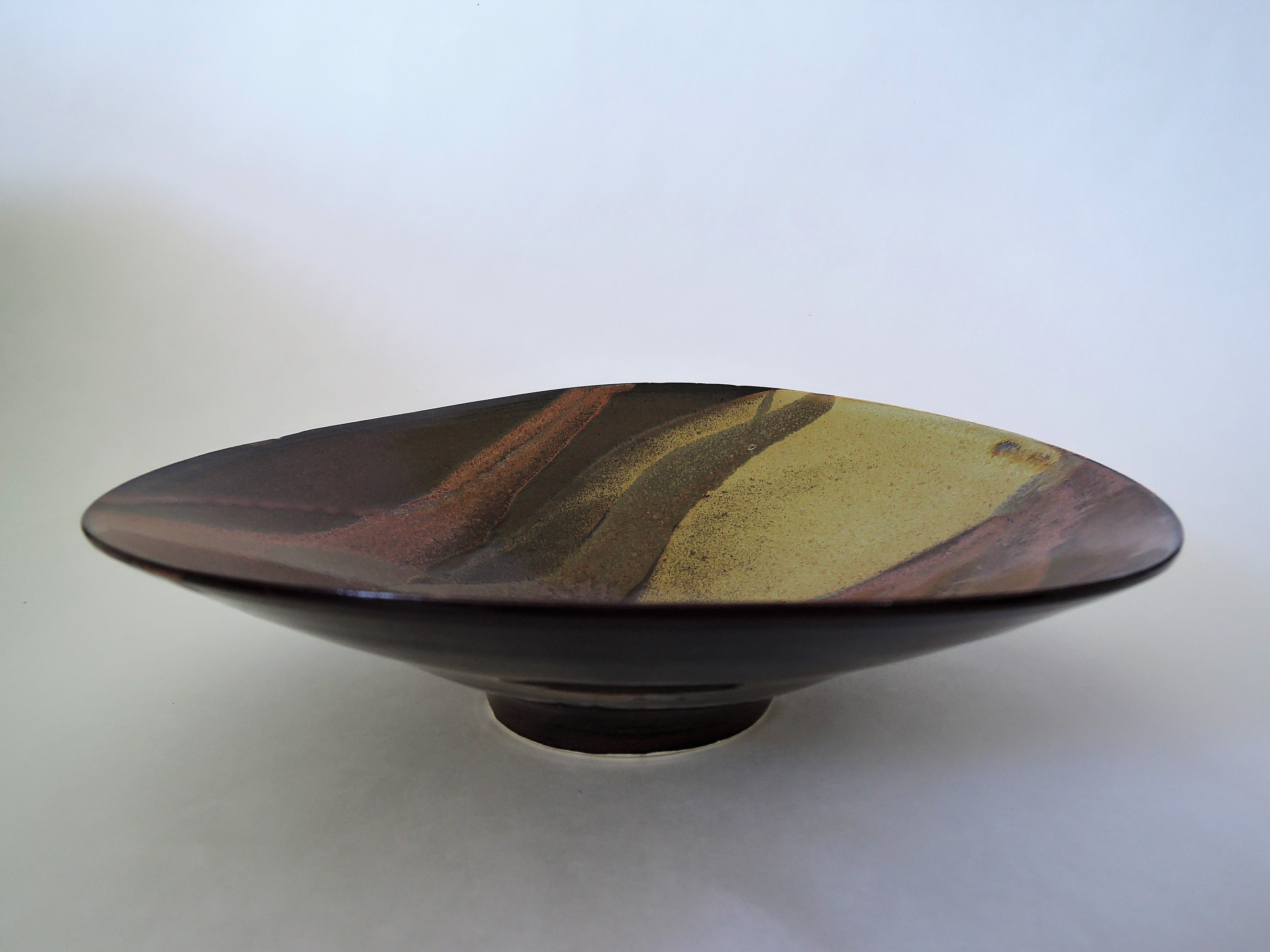
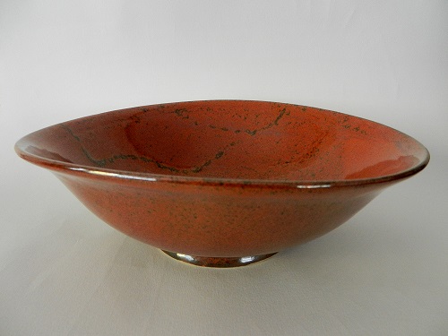
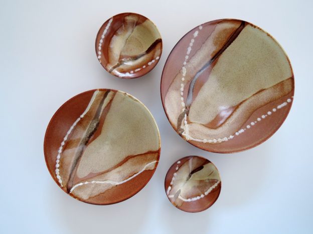
I’ve been making distorted bowls for some years now; what varies is the size, the degree of distortion, and of course the glazes I use. I started making them after my first ikebana teacher, at her home in the outskirts of Brussels, showed me a cupboard where she kept her favourite vases. These Japanese vases she took out were all lovely, but I was particularly struck by a wide bowl with its sides seemingly distorted inwards and upwards, creating a lovely wave-like effect.

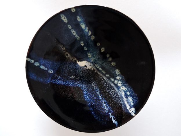
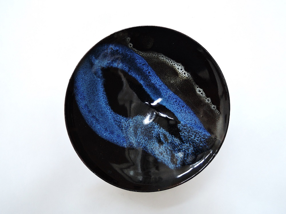
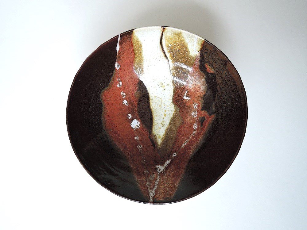
What I aim for is a bowl you’d want to hold lightly in the hand, twisting it round and to catch sight inside of the coloured trails of glaze drawing your eye to the wave-like rim.

Making them myself revealed a number of challlenges. Pushing the walls of a bowl inwards after it has been trimmed is tricky: the rims at the two narrower ends are inclined to crack, as is the part near the angle at the foot, if it is trimmed thin. Under the pressure of the hands, the sides of the base may also lift, so the bowl no longer stands flat on its trimmed foot. And the squirts of glaze don’t always create the pleasing line I want.

Those problems I have learned to cope with. But in the case here of the two larger bowls, which I distorted, they show little sign of it after firing. I can only think that my recent efforts at making lighter pieces, with thinner, more carefully worked walls, has meant that the walls give in more easily to clay memory (the tendency of clay to return to its earlier, unfired, shape), and to gravity, during firing.


Dimensions:

dia: 21/22 cm, ht: 5.5 cm;
dia; 18.5/19.5 cm, ht 5 cm;
dia: 11 cm, ht: 5.5 cm
dia: 9.5 cm, ht 4 cm

Porcelaneous stoneware, fired to cone 6, in oxidation.


Two bowls: Currents

In creating these two small bowls, my intention was to have the viewer want to not only look at them, but to reach out, hold them, and ponder. Their weight needs to be feel balanced and just right, the texture needs to be glossy and smooth; the trails of colour, with their balance between careful application and chance disposition, should invite the viewer to come up with a pleasing interpretation.

To enhance the smoothness and brightness of the clay surface, I dip the piece in a Frost slip (cone 6 porcelain), which has much finer clay particles than the stoneware. The glazes I choose are ones that break attractively, providing a speckled effect as they run down to the centre over the iron-rich base glaze.

The original stimulus for working in this style came from a Svend Bayer exhibition at the Greenwich Pottery, New York. Though he is particularly well know for large, wood-fired pots, I especially liked the bowls he decorated with trails of glaze of different intensities.

Currents 1: dia: 16.5 cm; width: 4.5 cm. Thrown: stoneware, fired to Cone 6, oxidation

Flotsam

From yesterday’s kiln; a small bowl, as a test for a couple of big bowls that are just out of the bisque kiln. These new ones I’ve made much wider and shallower, hoping that applying the trails of glaze will then be less treacherous. With the  sharper curve as seen here, if the glaze is just a little too wet, it tends to break away from the sweep of the line, creating a new, discordant line downwards… Washing everything off, and starting over, is time consuming and more than a little frustrating. I’ve added a sprinkling of white to the outside, as a link between the inner and outer surface.

Di: 15 cm, ht: 6 cm. Cone 6, porcelaneous stoneware.

Flotsam-side-5april2017DSCN4912

Distorted bowl

Thrown using a white stoneware, trimmed while still quite wet; I find the body has to be quite damp for me to be able to distort it by forcing the sides inwards and  upwards. My combination of Brussels and Ottawa glazes are finally doing what I want. Here I first dipped the piece into the base glaze; then, using a cup, poured a good splodge of a white down the middle (which then turns into a yellowy gold); finally, I used a slip trailer to squirt thick trails of Bailey’s Orange-Red towards the edges of the bowl. Over the first iron-heavy glaze, the orange red really does flash red, over the second white glaze, it gives a darker, more silvery hue.

Di: 25 and 26 cm, ht: 7 cm. Fired to Cone 6, in oxidation.

DSCN4853enhanced

Orange-red bowl – distorted

I am still working on how to consistently get this gorgeous orange red. This is a potash feldspar/bone ash glaze with additions of iron oxide, as Michael Bailey sets out in his book Glazes, cone 6, 1240°C. He shows the gradations of colour obtained by increasing the amount of iron oxide by 1% each time.

Of course, there is always more to it than meets the eye. I’ve managed to get some wonderful results on test pieces, using 6%, 8% and 12%, but they don’t replicate on full-size pots, at least not consistently and not both inside and outside… Sometimes a thin layer of glaze is bright and successful, but when I actually dare to use on a piece, it’s all rather disheartening: often it comes out of the glaze kiln a dirty brown. And since I use shared workshop space with others, I am limited to the kiln temperature used by the group, 1260°C (so considerably higher than the specified cone 6).

Starting again this month, I have gone back to another workshop, where my former maître, Alain Losa, is teaching. They fire at 1250°, so closer to cone 6. I’m hoping that by re-doing my tests, measuring the specific gravity of the glaze, and picking his brains, I can make this work. People like orange-red, so if at first you don’t succeed…

So, you may be asking, how did you manage to get this glossy orange-red?

Luck. I refired the inside of this distorted (not bad, but in my opinion dirty brown) bowl a couple of weeks ago, recoating the inside with an orange-red at 12% iron oxide (I’d used 8% the first time). I did nothing to the outside, as it was pretty good as it was. I’m happy this time.

Fired in oxidation, to 1260°